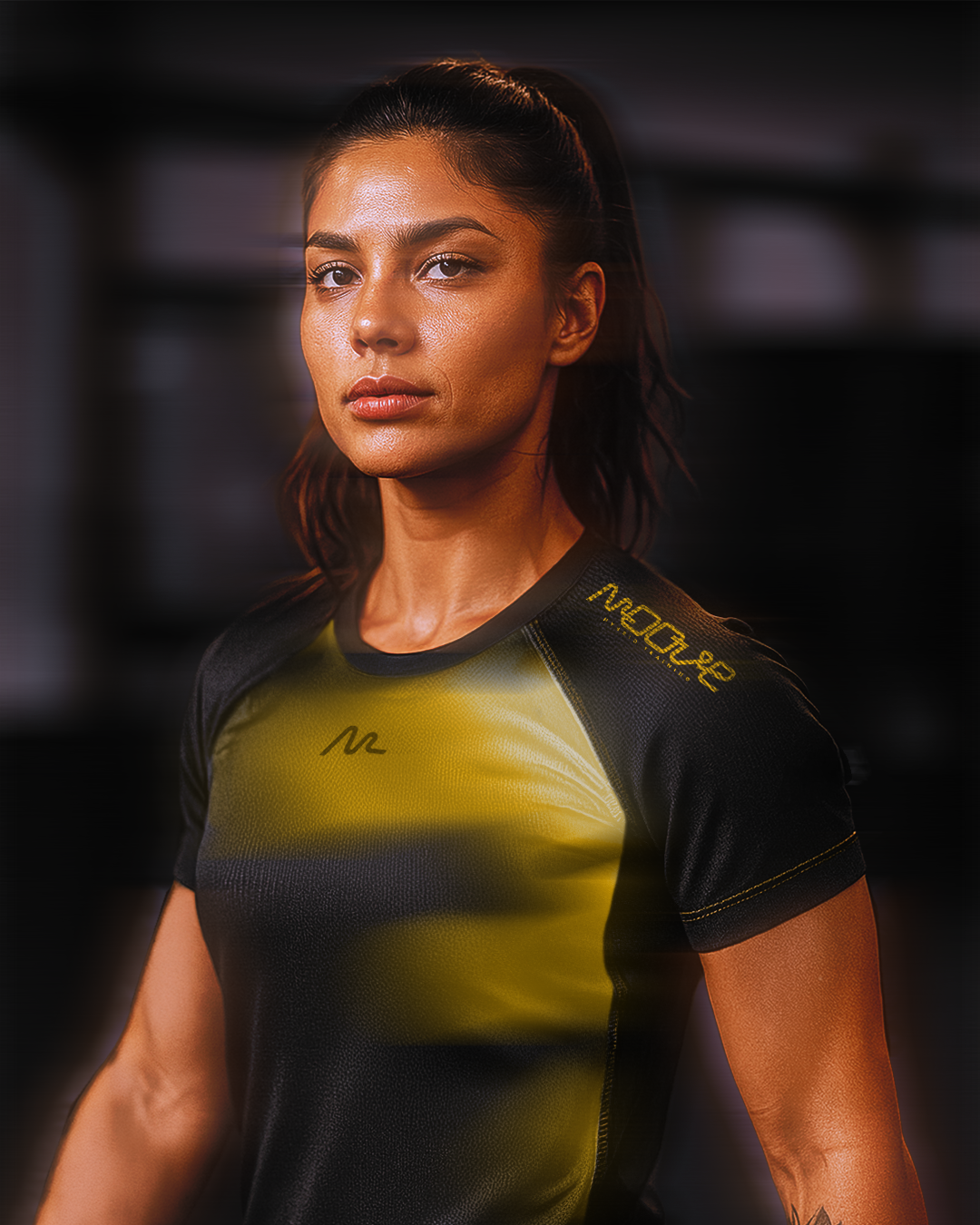
Moove Hybrid Training is a fitness box designed for those looking to break out of a sedentary lifestyle, improve their health, and build consistency.
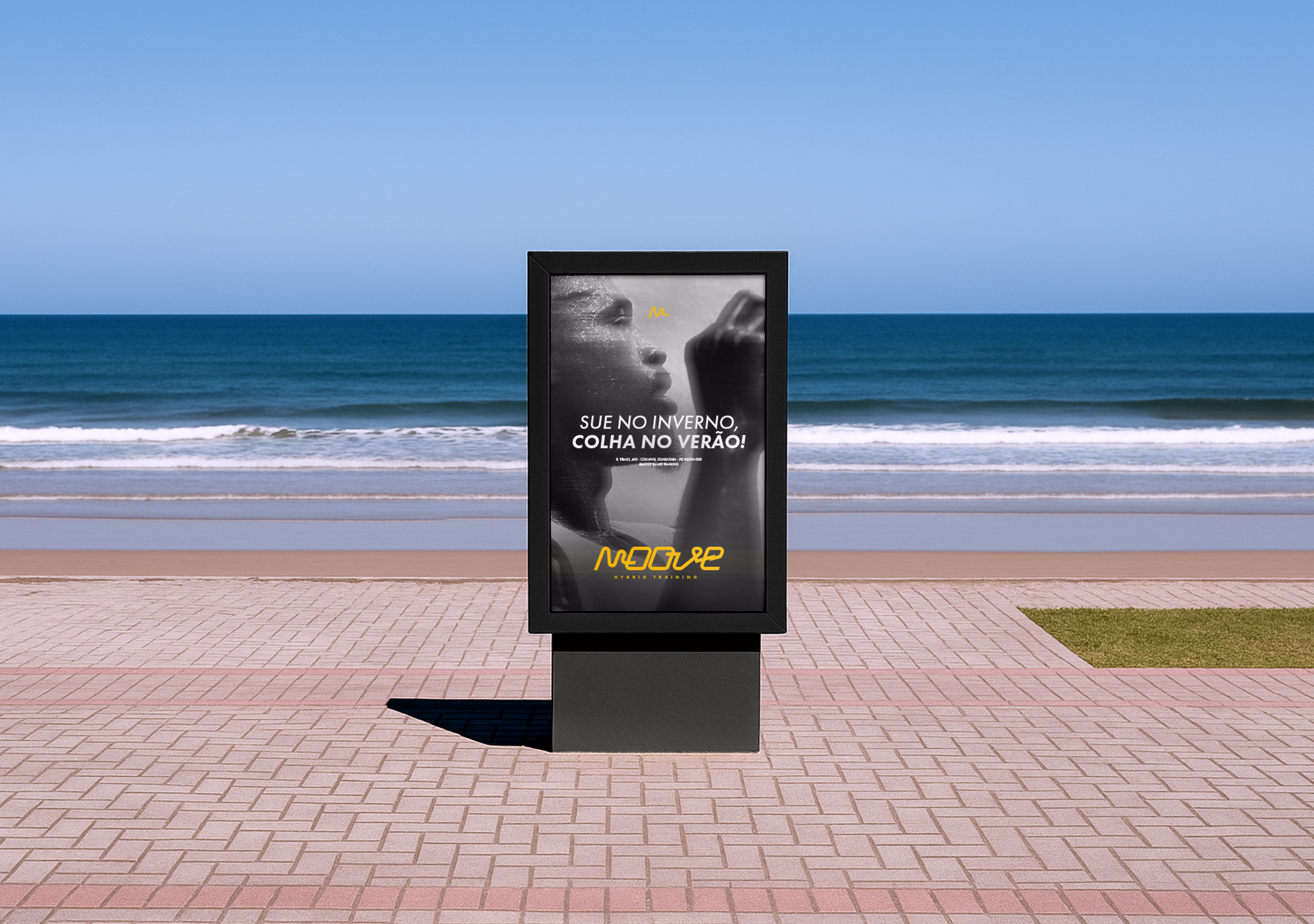
The visual identity redesign project aimed to reflect Moove’s moment of transition and evolution, now focused on hybrid training, combining running and high-intensity workouts. The goal was to express the brand’s essence in an authentic, versatile, and contemporary way.
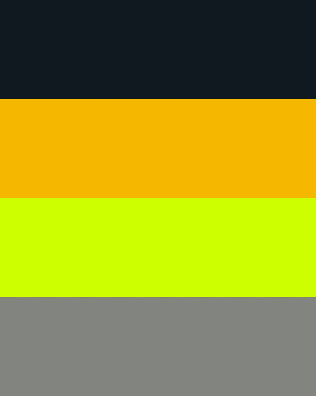
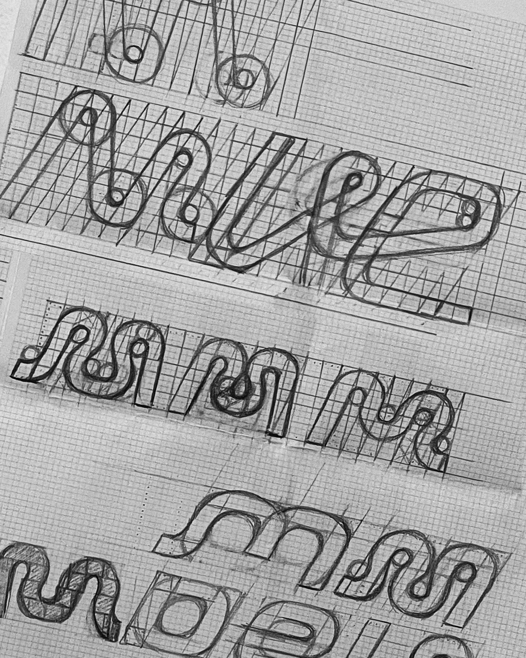
As part of this evolution, the color palette was expanded with the addition of a neon tone, designed especially for use on social media and digital materials, bringing more energy, impact, and presence. In addition, the new symbol, extracted from the logo and created exclusively for Moove, carries the representation of a heartbeat, visually reinforcing the idea of intensity, effort, and connection with training.
More than just a visual update, the new identity system was developed to convey the brand’s core pillars, movement, well-being, and community, and to connect directly with an audience looking to break out of sedentarism, build consistency, and embrace an active lifestyle.